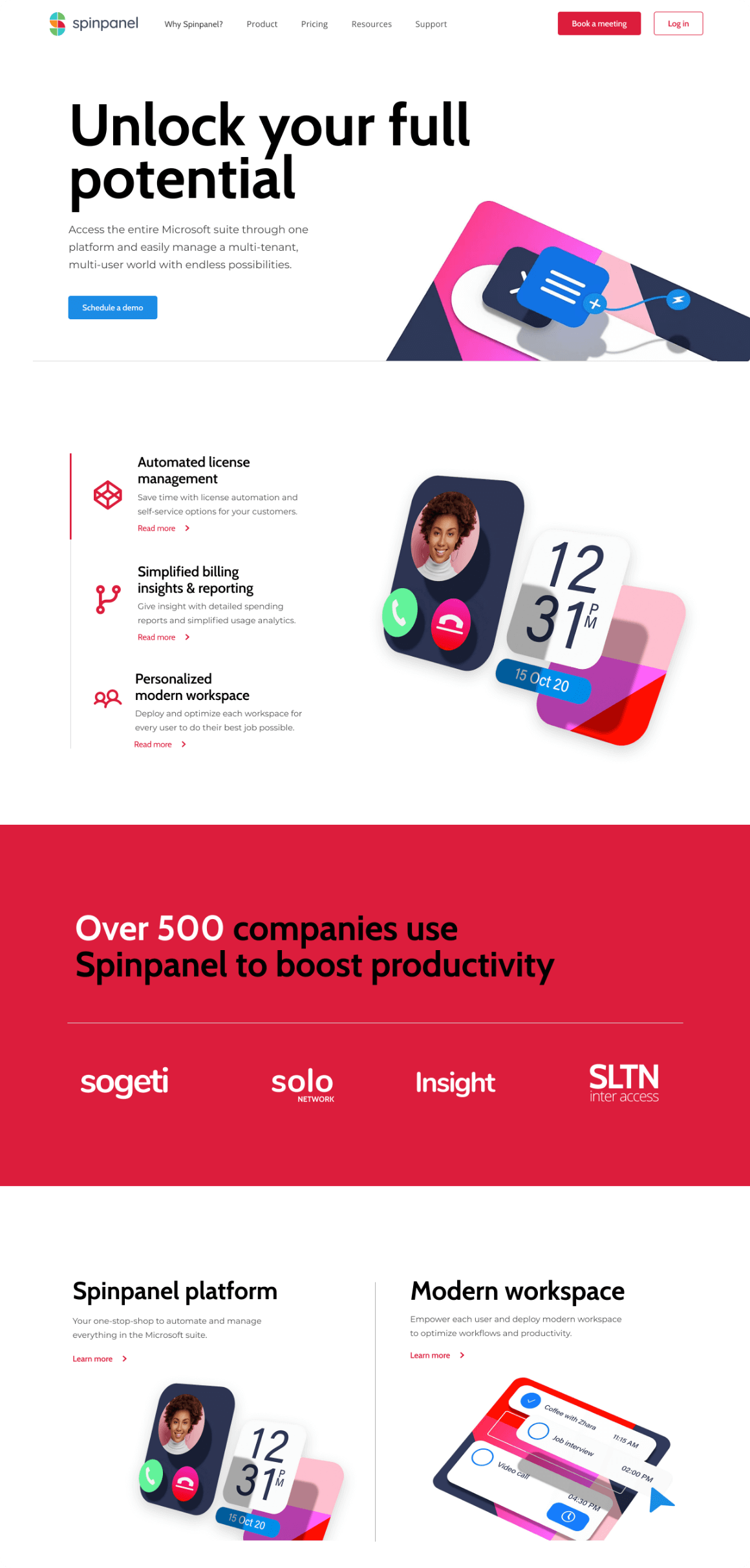
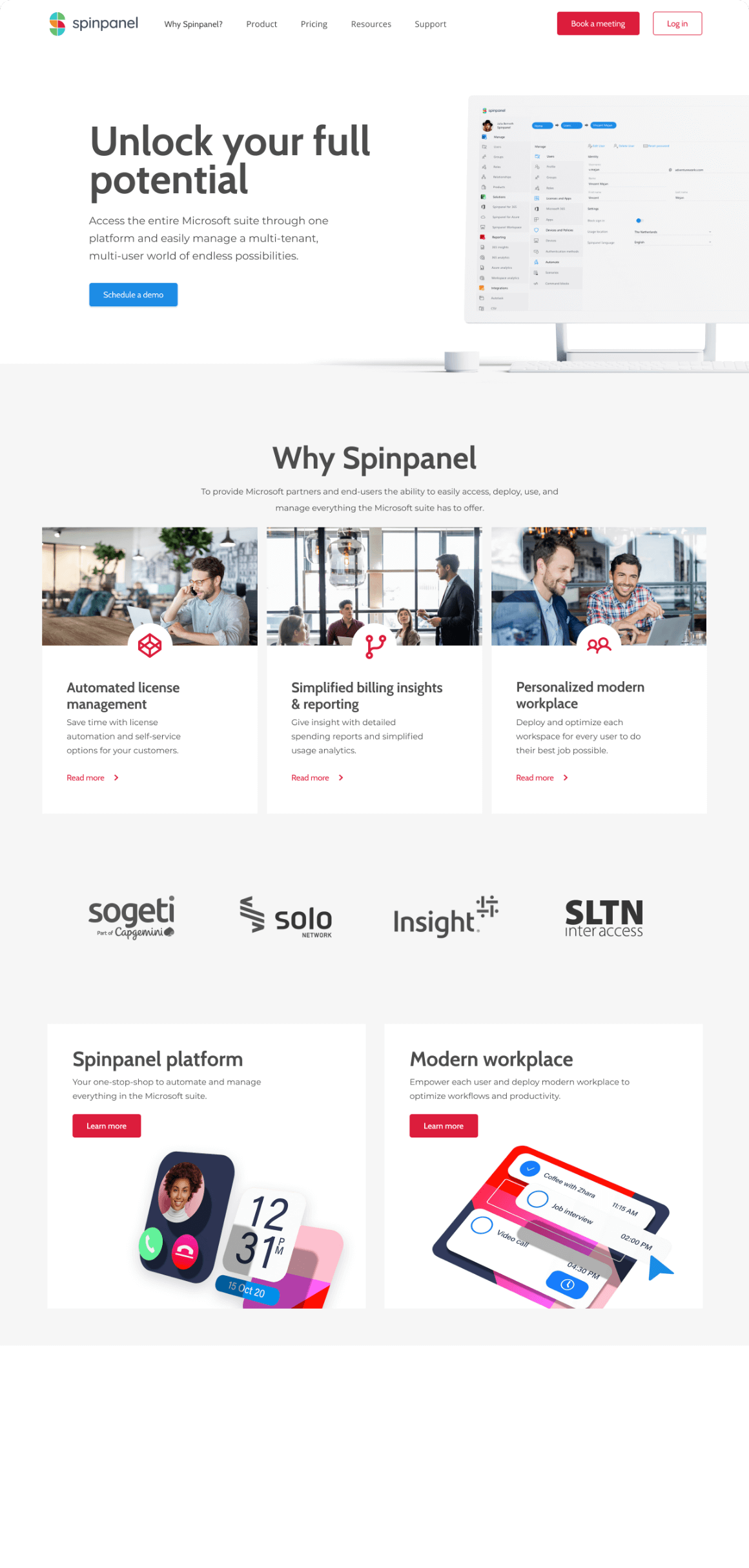
Spinpanel
Spinpanel provides a single user interface on top of the MSP Microsoft portal. This to attain higher productivity and better work processes by combining all your needs into one easy to use platform.
Role: UX/UI Design
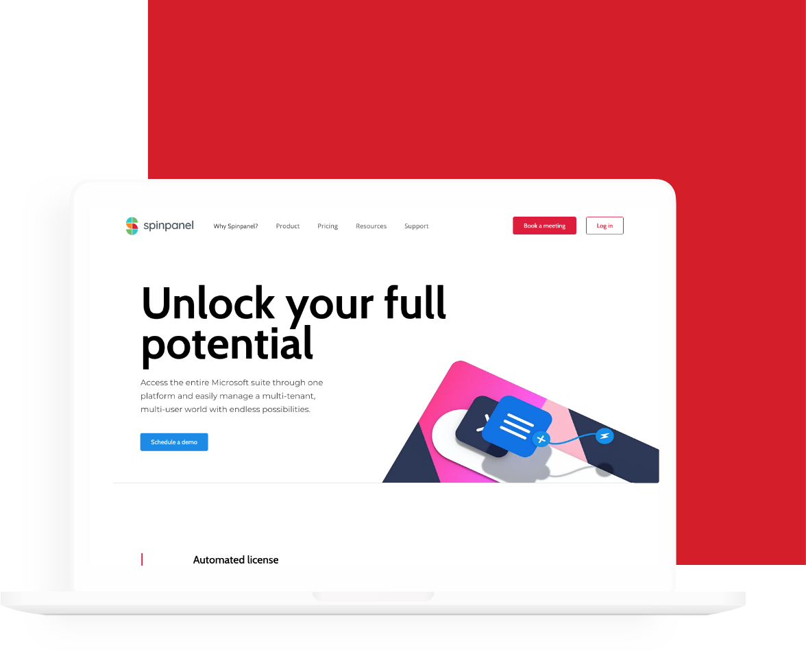
Defining the problem
To get an understanding of the old website and its content I ran a content audit listing all available information and features. Based on this, we collectively decided what to keep, what needed to be added and how to structure the content more intuitively.
Web audit
Besides the content audit I also ran a web audit, to list all the websites current pain points, structural issues and design issues based on the basic design principles. Running into issues like multiple layers of navigation on some pages, inconsistency in structure, use of typography and in general a confusing top menu.
SITE STRUCTURE
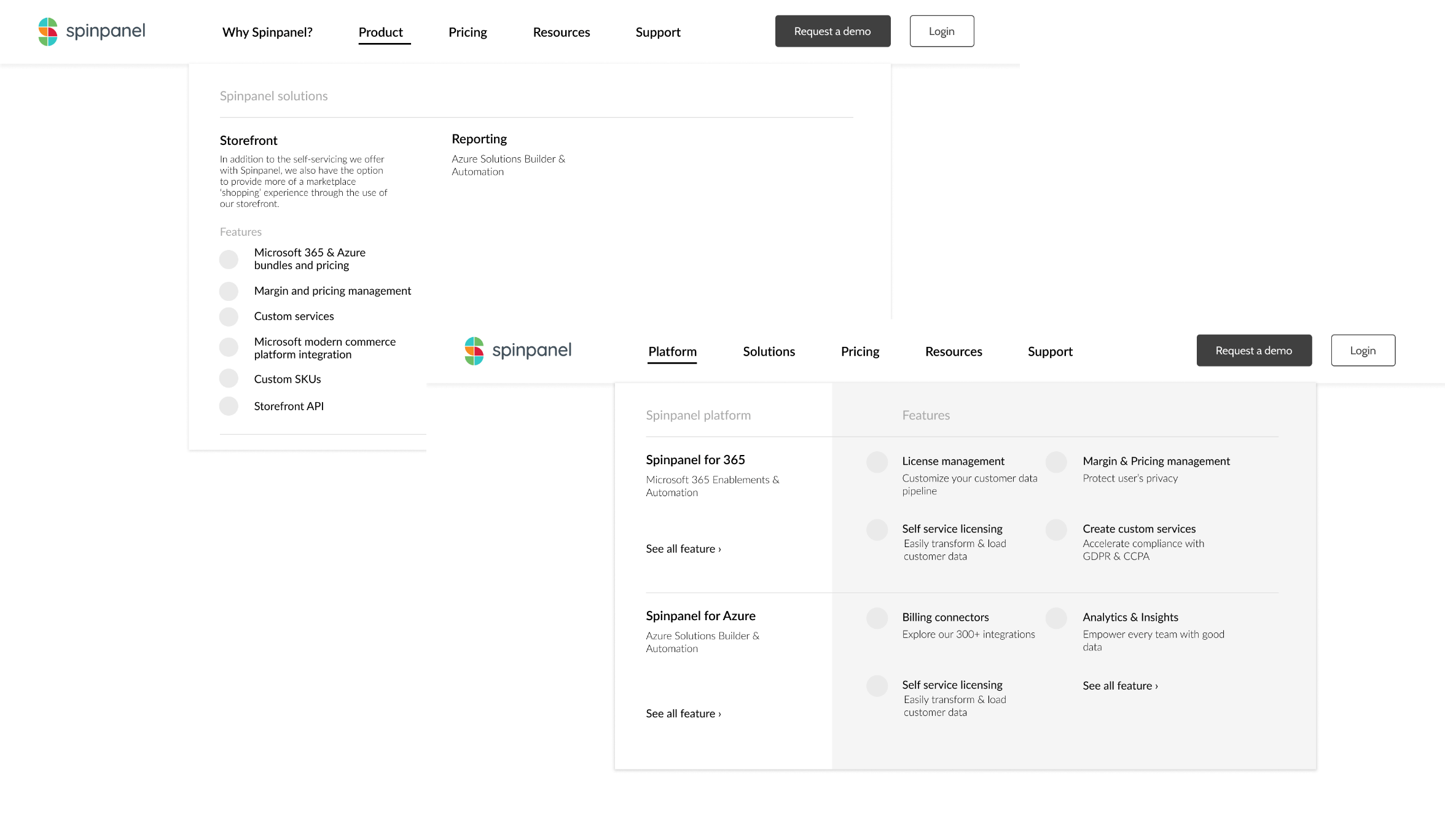
Information architecture
I set up a workshop together with our team and the client to develop a basic sitemap. Taking into account the target personas, the solutions they currently offer and the upcoming new releases as well as the objectives of the organization regarding the website.
Site structure
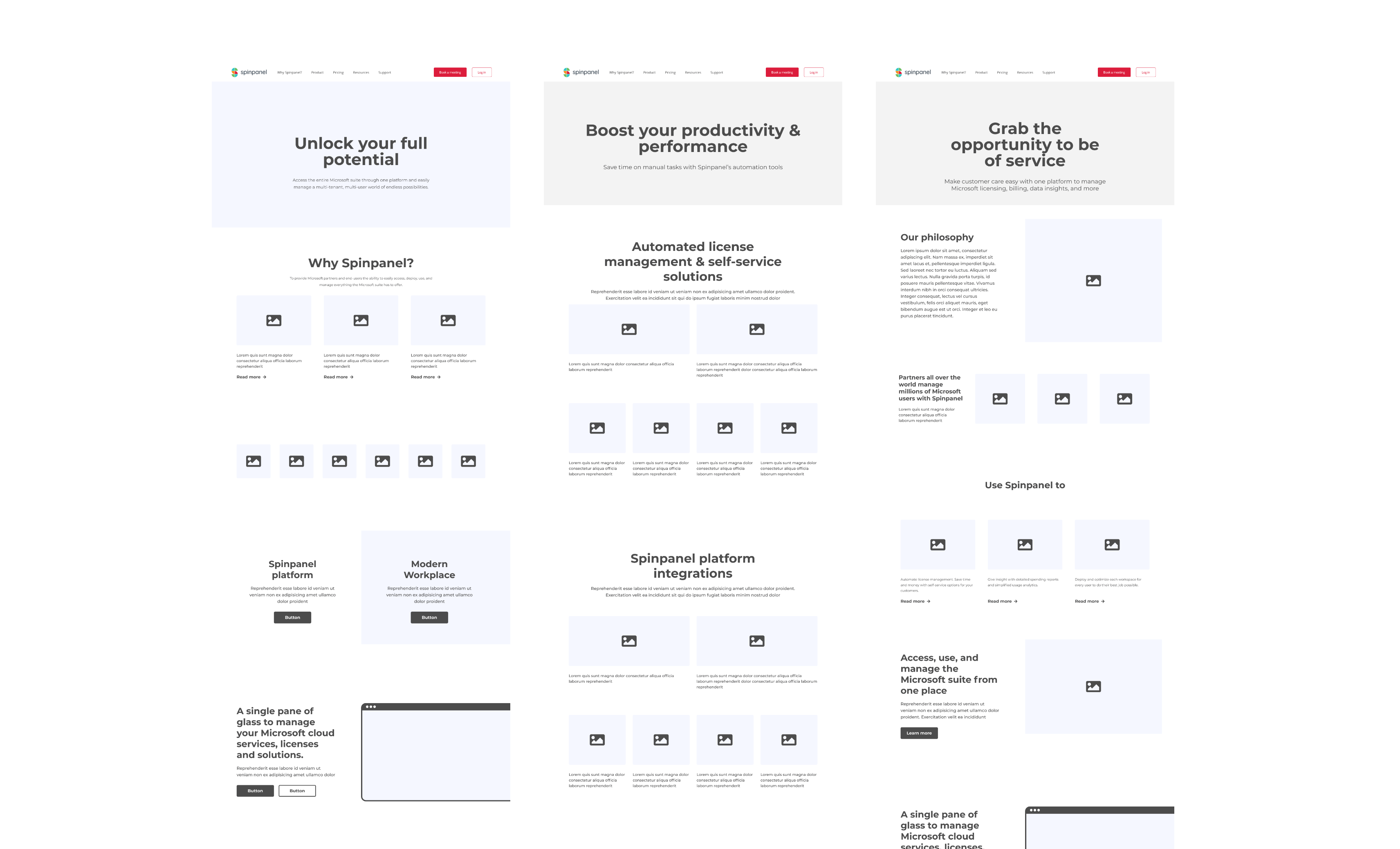
Creating low-fidelity wireframes as a means to discuss the new site structure with the client. This took a few discussions and reiterations to shift the focus from specific features to solution based communication.
LOW-FIDELITY WIREFRAMES
Design
After defining the site structure I moved on to creating the wireframes for the different content pages the site was going to need. Meanwhile also starting work on a visual style in terms of a design system for an easy handover to development.
Visual style
Proposed two different directions of visual style for the redesign of the website, before handing the project over to our visual designer to fine tune the remainder of the visual design.
WEB DESIGN
