Typeqast
Typeqast is an innovative company by providing agile development teams as a service. Also known as nearshoring. They had grown quickly over the past years but struggling with getting more consistent deals signed and branding was all over the place.
Role: UX/UI Design
The challenge
The challenge was to optimize the website so improve conversion leading to more leads and deals. The current website got a good amount of visits but I didn't convert. We needed to analyse why conversion was so low and how we could improve it. Based on the new website we where also able to get automated marketing channels set up and working better.
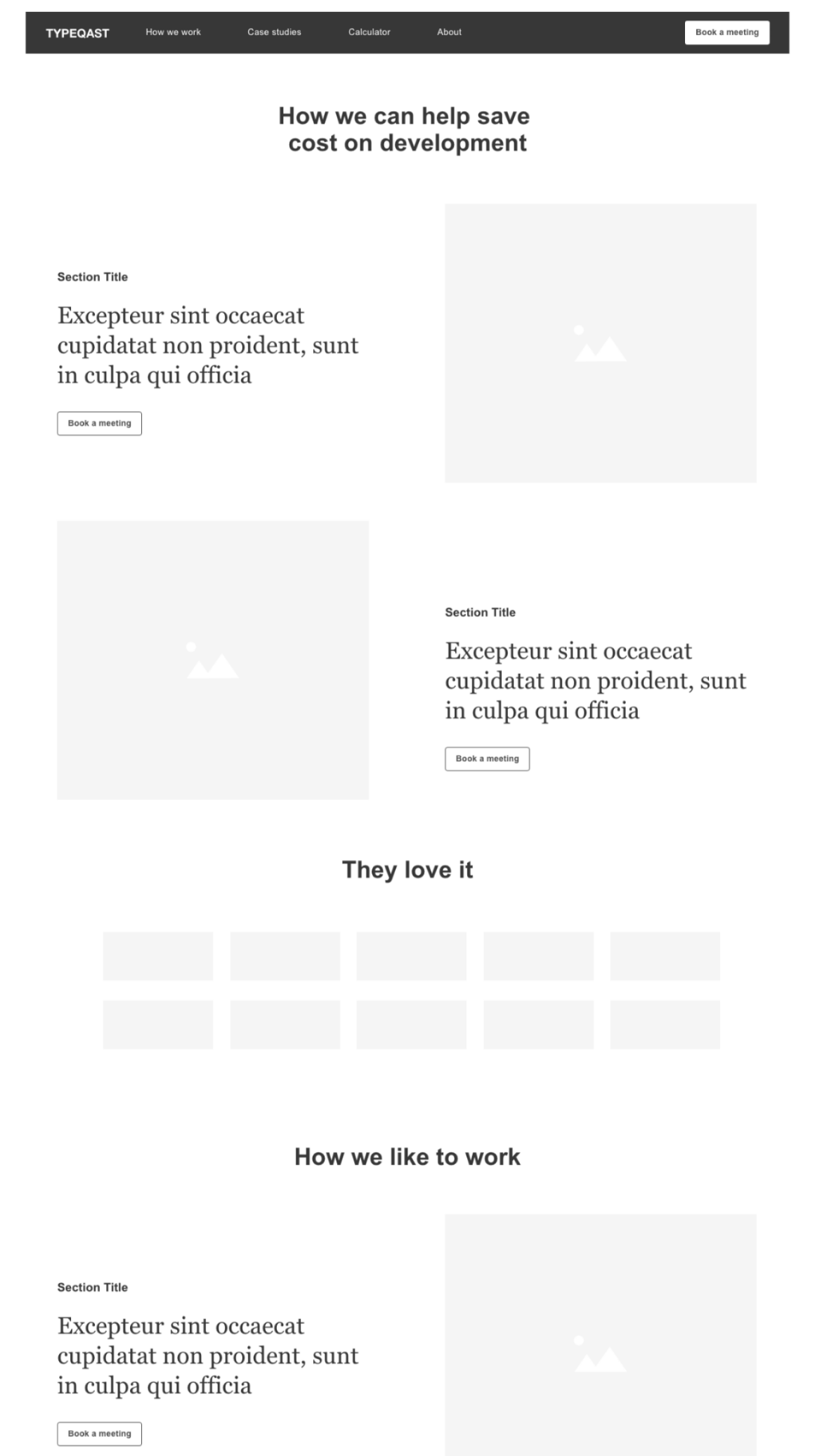
LOW FIDELITY WIREFRAMES
The process
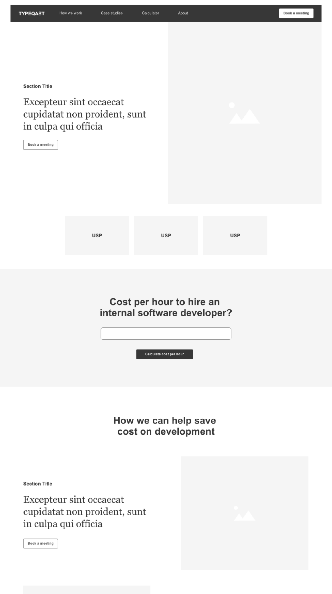
My part in the team to take on this challenge was to analyse, optimize, design and get the new website developed. After doing a web audit to get a clear understanding of pain points on the current website I started creating the new navigation structure and defining which content pages we needed. Based on the analyses and new structure I created wireframes to work with the client on the new layouts.
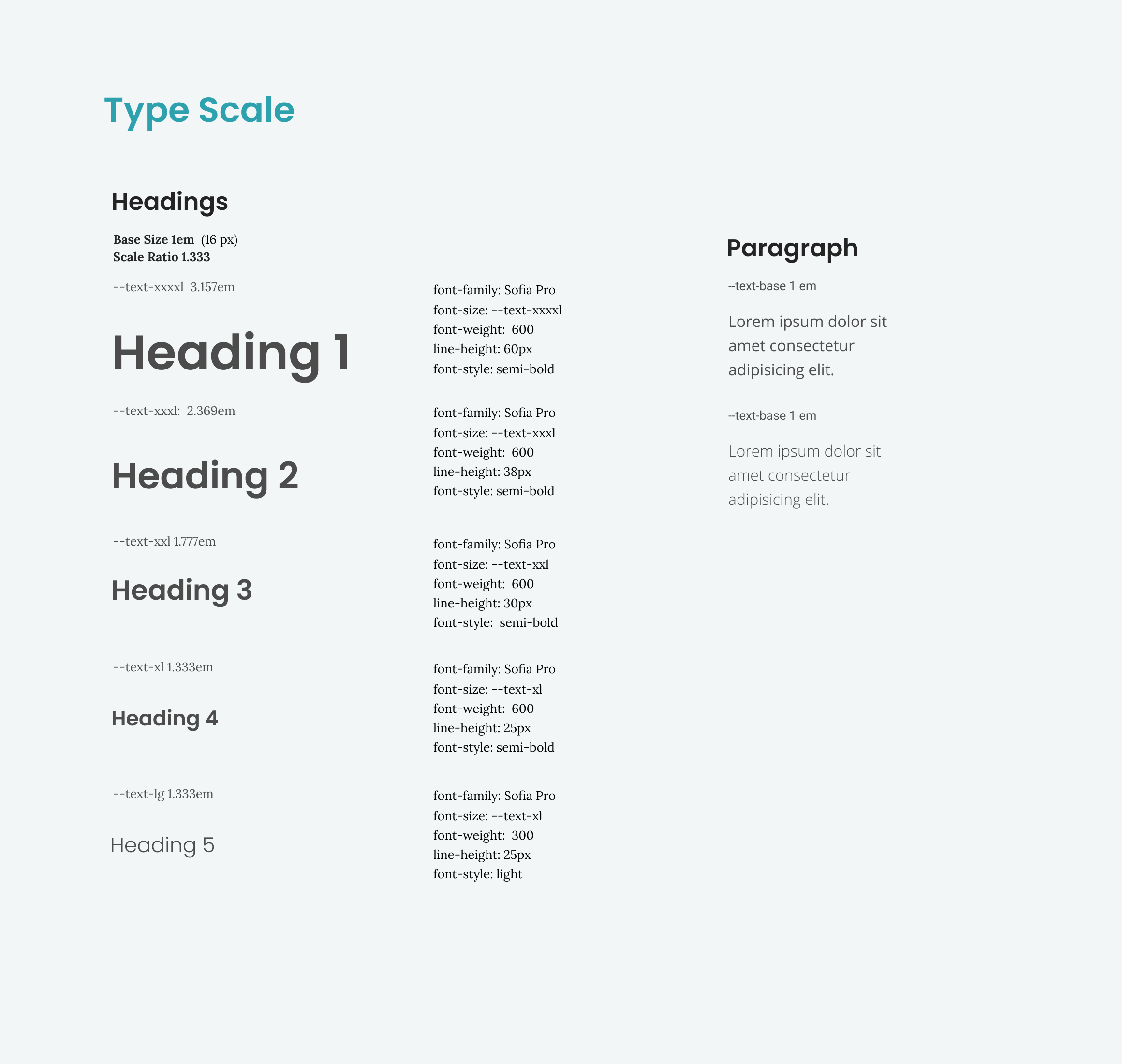
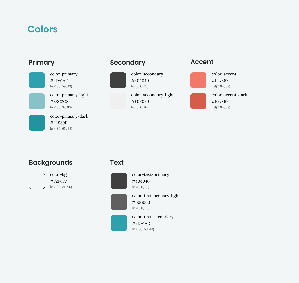
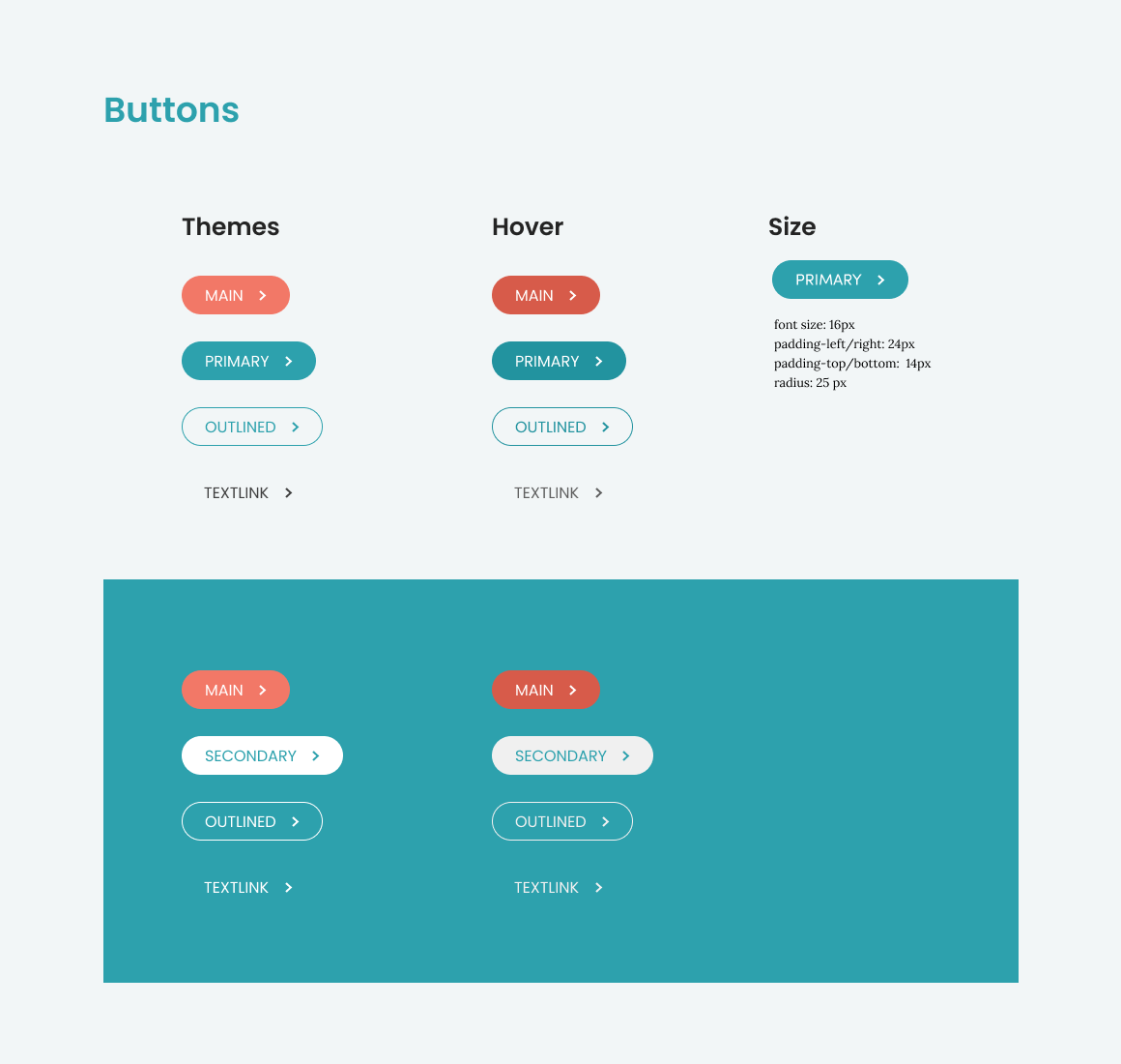
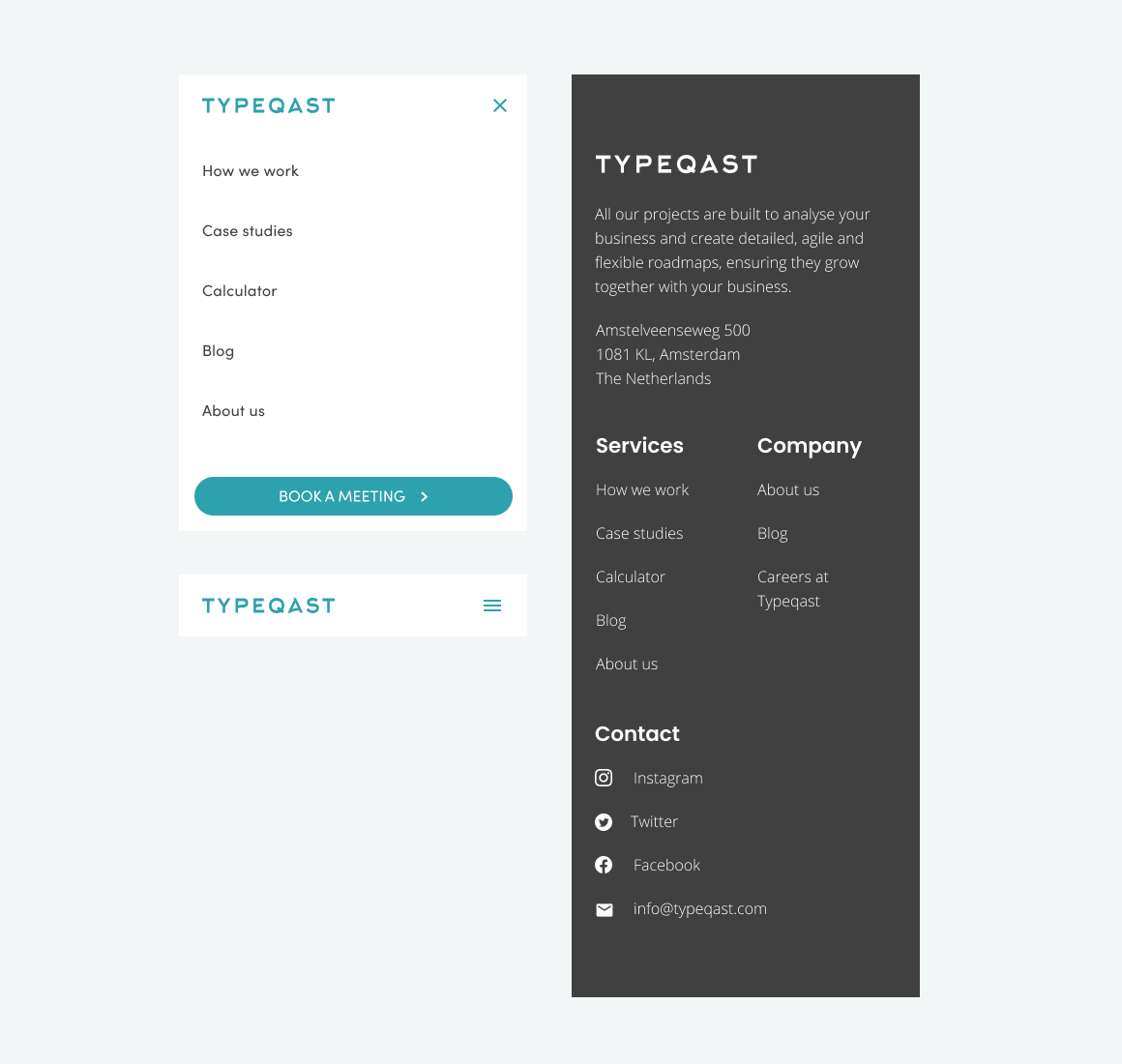
After approval I started defining the new visual design and created the style guide which served as base when designing the visual layout for all the pages on both desktop and mobile. And finally collaborating with the developers to get the website up and running.
The solution
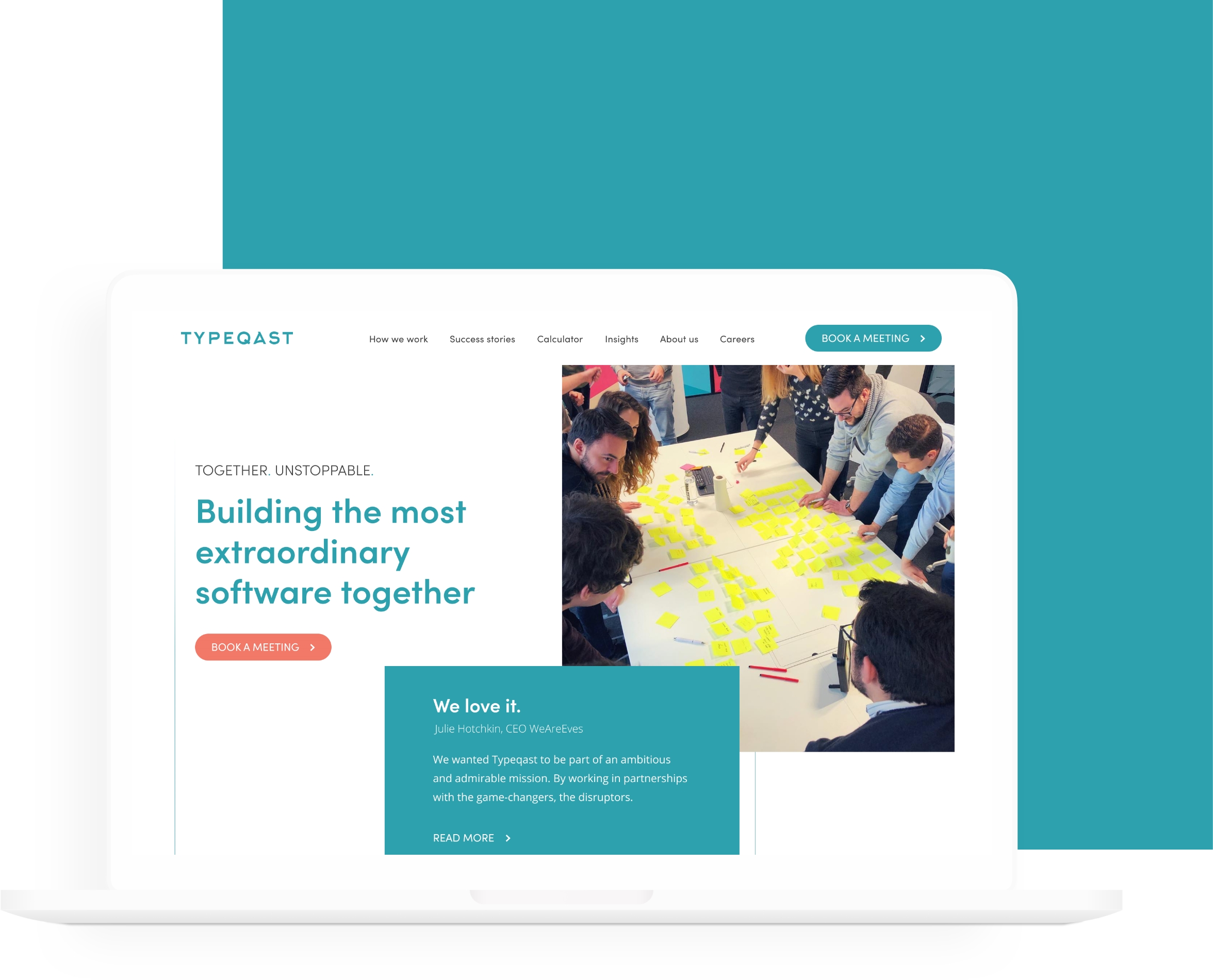
A revamped website focused on the success stories Typeqast has made for their other clients, based on best practices. The new website is much easier to navigate, it is consistent across all pages and other media. Adding a lot more emphasis on the very well converting calculator tool by making it more prominent and easier accessible on the website, while at the same time capturing leads for the sales team.
VISUAL DESIGN
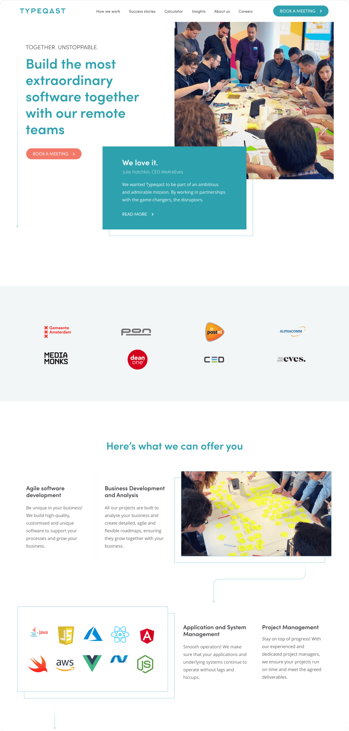

Website live at typeqast.com
