Monty
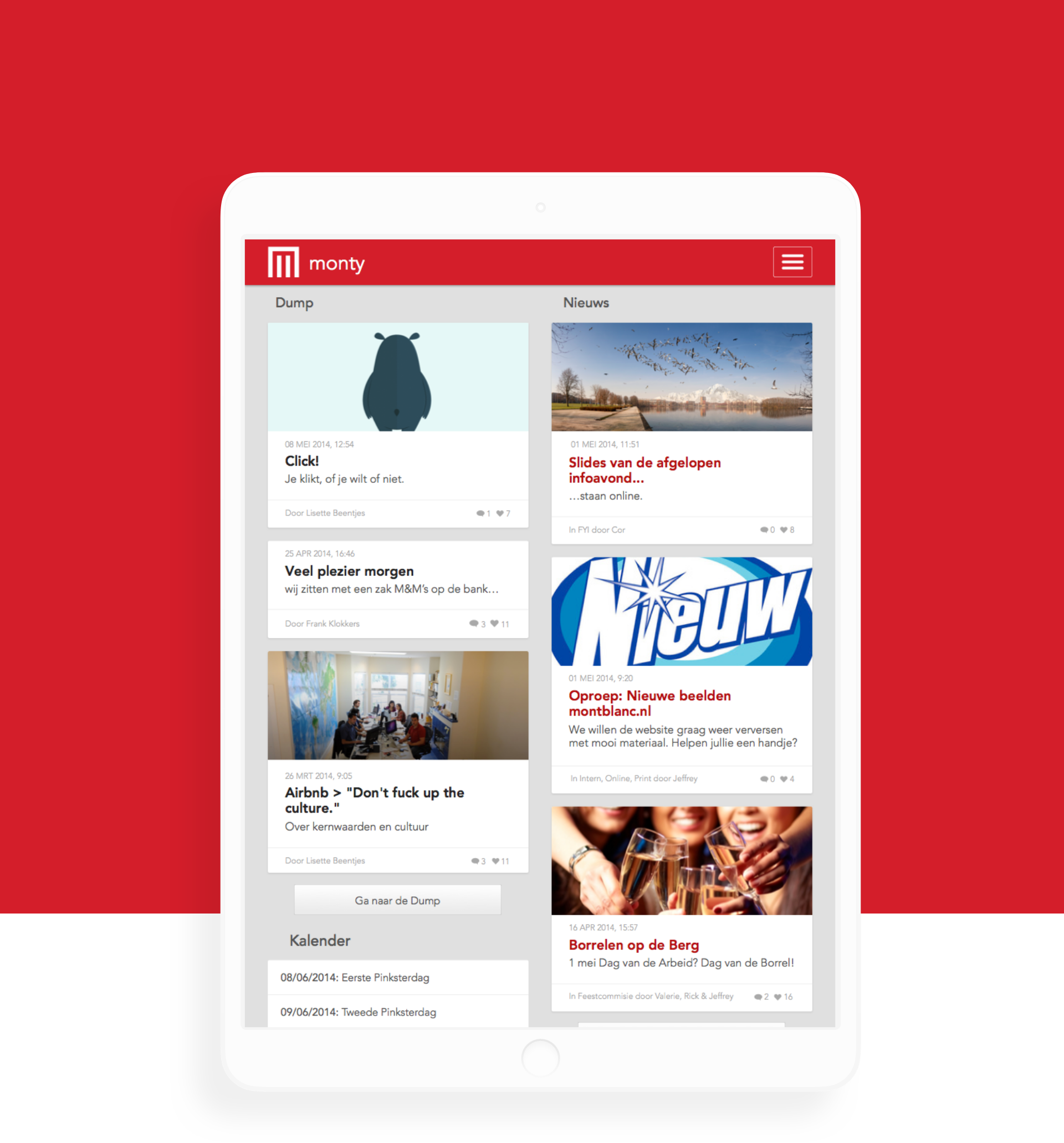
Monty is an internal tool used and developed by Montblanc to keep track of hours spend on projects, event invites and a social section. The tool worked on desktop but was far from usable on mobile devices, hence they asked me to redesign the tool and make it work responsively.
Role: UX & UI design
Responsive Internal
management tool
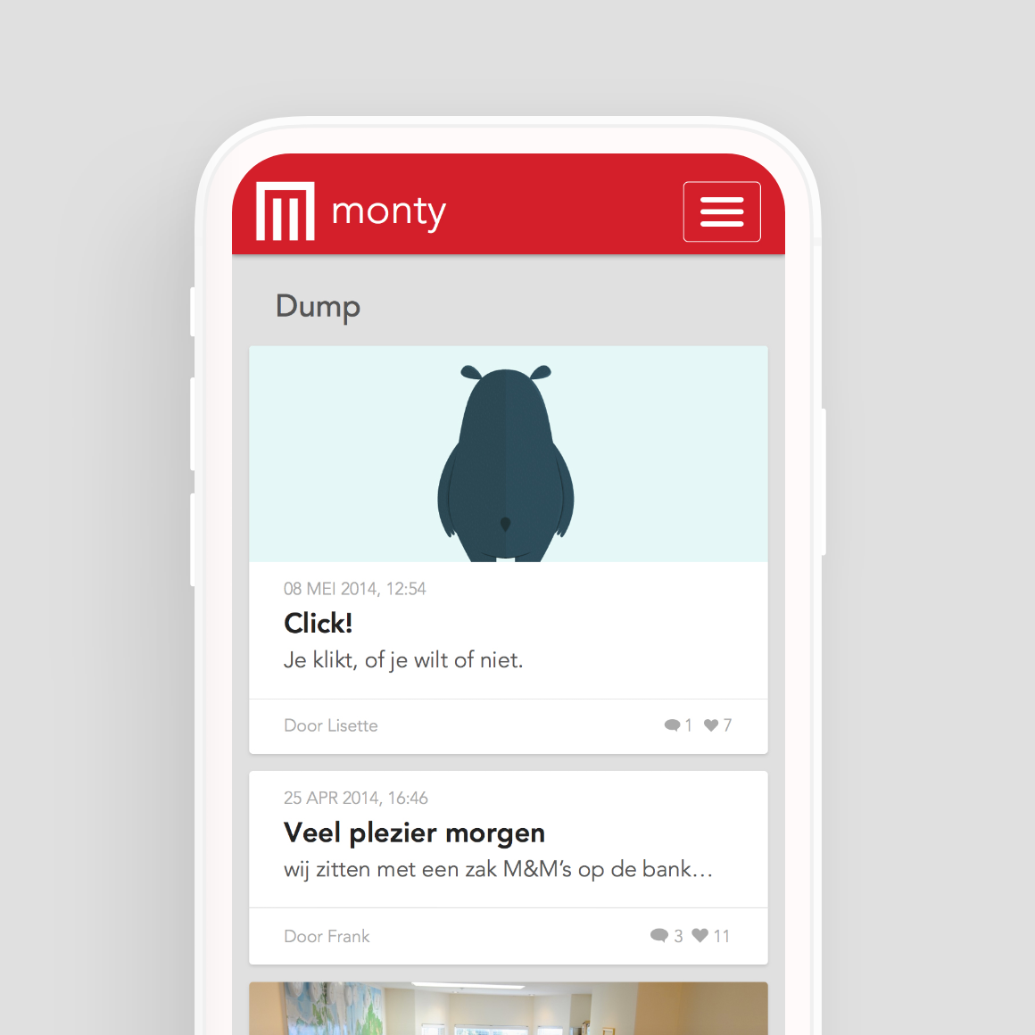
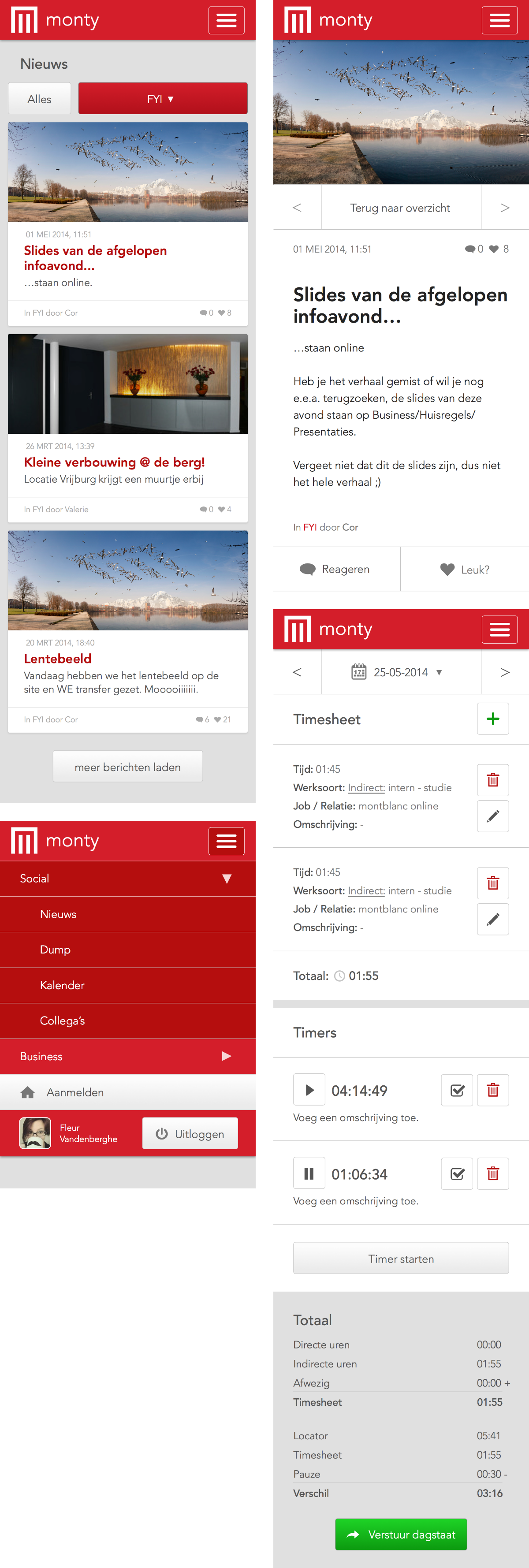
The tool was fairly dated and was not build to work on smaller devices, even though most employees would like to be able to use it on mobile more often than on desktop. So I took on this project with a mobile first approach.
Sharing and
Informing
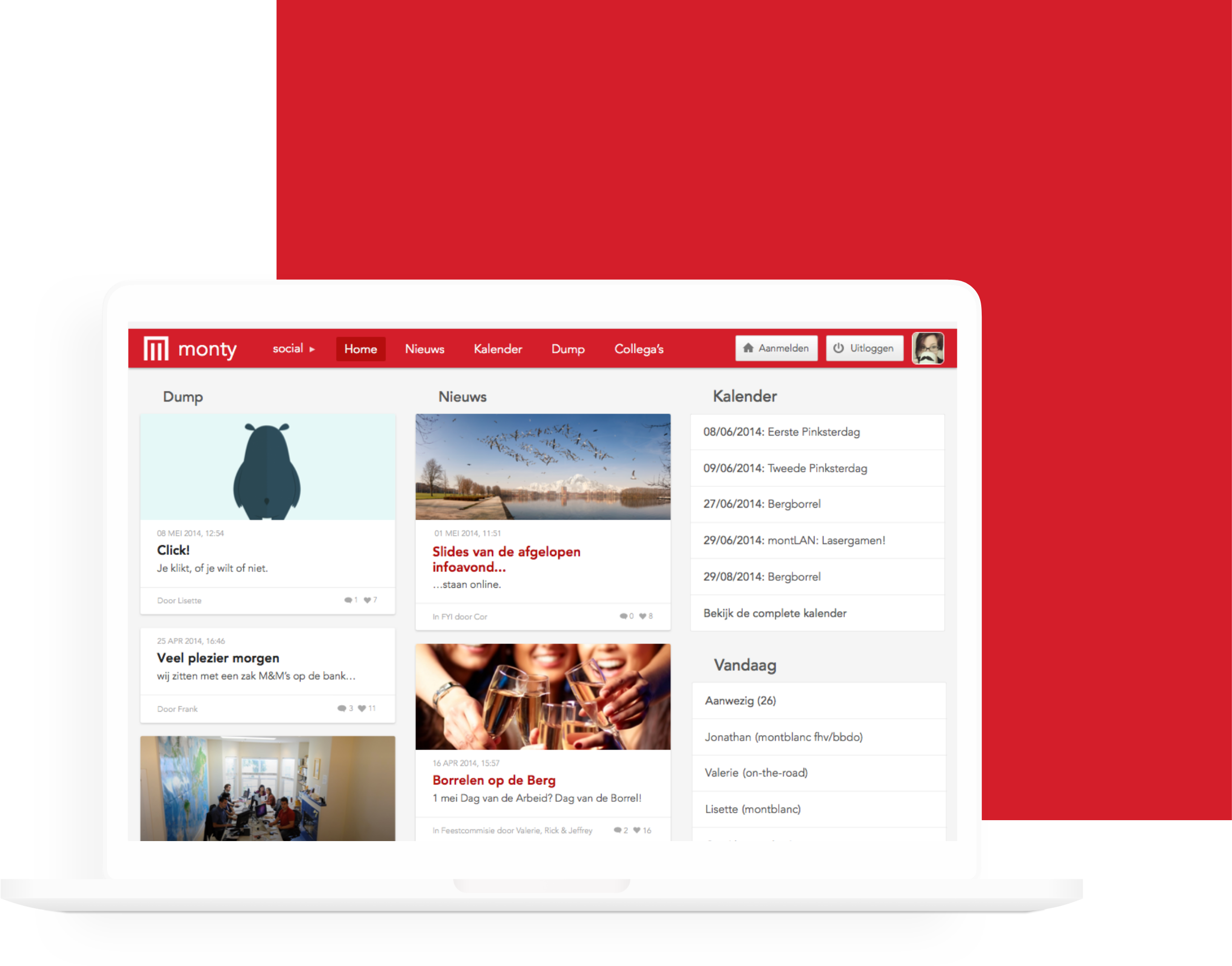
The tool is advanced with several modules, ranging from a section with important news that’s been shared throughout the company, a section to share cool and fun stuff with your colleagues. As well a section where everyone can see who’s out on the road for a meeting, working from home or at another office. Besides that it contains a time tracking tool to keep track of the time spend on projects.

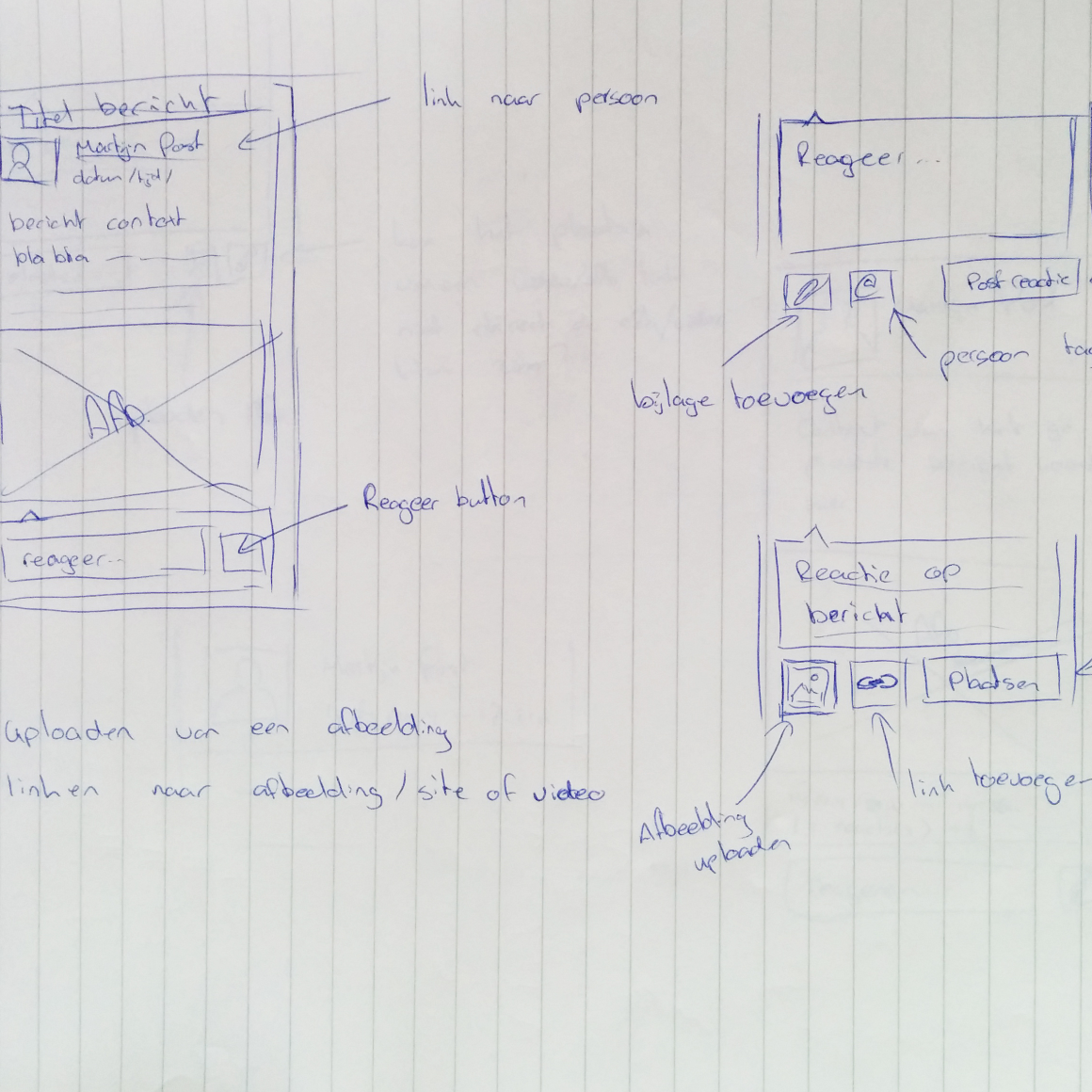
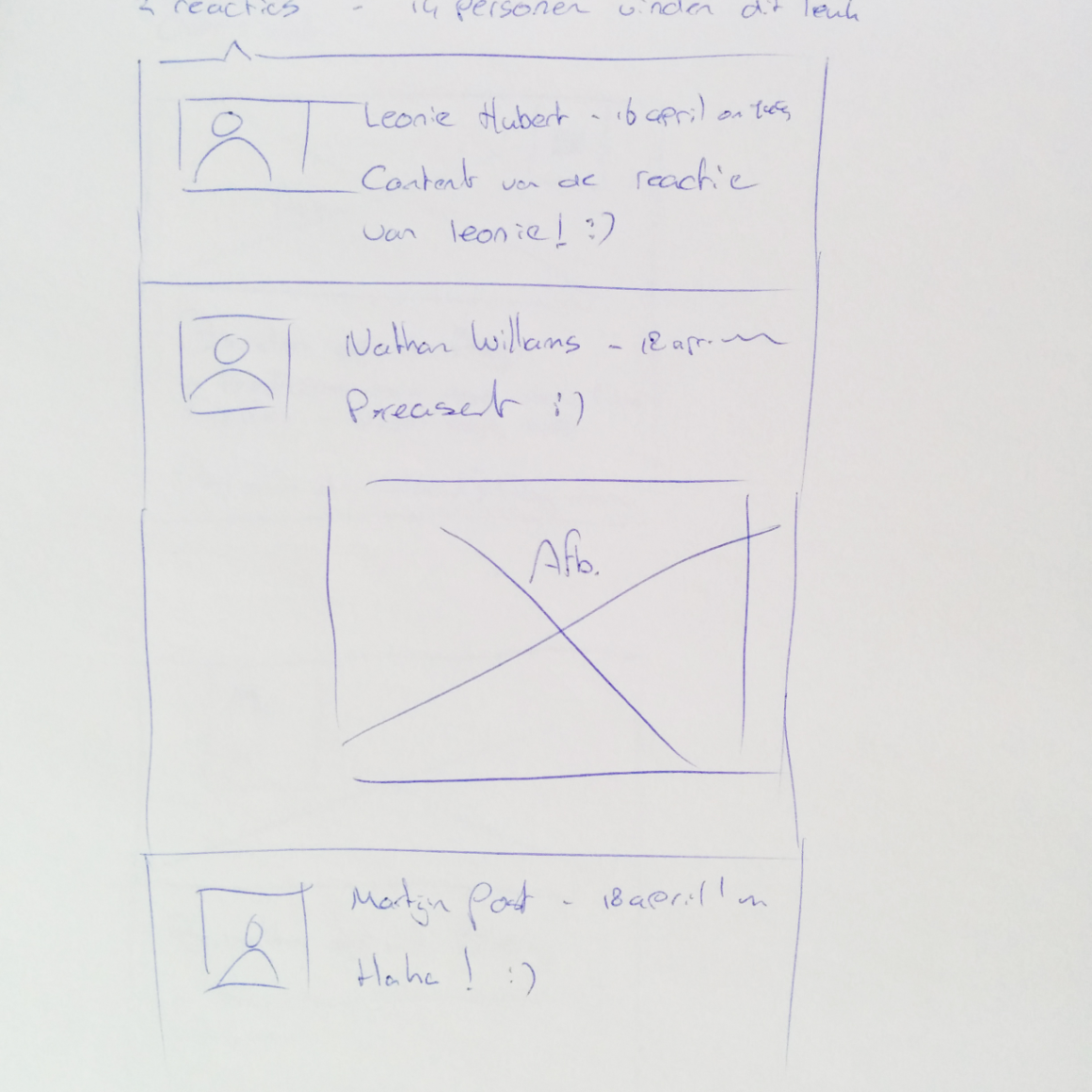
Wireframes and testing
At first starting with some research to find out which areas are most used and need to be easily accessible. After conducting this research I started sketching some wireframes to then put those to test and improve. During the whole project I continuously reiterated by running test at several stages and going back to the drawing board to fix issues and improve improve the overall product.
